Sub It Club welcomes MacKenzie Haley to The Postcard Post. MacKenzie shares an adorable postcard and her process– step by step!
MacKenzie Haley is an somewhat anxious illustrator residing in Louisville, KY. She got her BFA in illustration from the University of Dayton in 2002, but it’s taken her a while to figure out how to make this illustration thing a career (she’s still figuring it out). She’s run two full marathons (slowly) and fostered about twelve cats (not at the same time). She loves cats, drawing cats, and cats that draw. Oddly enough, she’s obsessed with horror movies, though she draws mostly cute things. She signed with Advocate Art an the end of 2017. She sells prints of her work in her Etsy store, MissKenzee.
How do you choose the image(s) for a postcard?
Choosing the image on the postcard has always been an intuitive thing to me. I try to imagine myself in an art or creative director’s shoes, and think about what would draw my attention if I’m quickly thumbing through a stack of postcards on an almost daily basis. It has to be something different. Pretty art is good, but I think different is even better and goes a lot further.
Do you prefer text on the front of the postcard with the image or do you prefer all text on the back of the postcard?
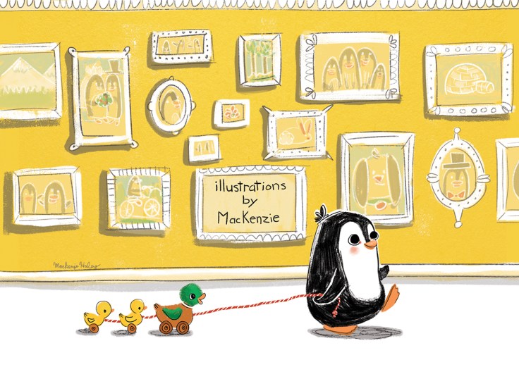
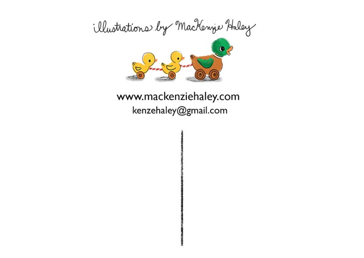
Many times I don’t have any text on the front. If it’s a good piece and it catches someone’s eye, they’re going to turn it over and see who made it. That’s where I usually put all of my information. But I keep it to a minimum, my website address and my email. I don’t want to overwhelm the person. It’s definitely key to include you website/portfolio address, so they can see more of your work and get a better feel for you. On rare occasions I do put text on the front, if it looks good and doesn’t feel forced or crammed in there. It usually just says “illustrations by mackenzie,” nothing too fancy.
Do you create illustrations specifically for your self-promotion pieces?
I used to create illustrations specifically for with a postcard design in mind. But these days, I’m more apt to create pieces based on what interests me, and many times they can be adapted to the postcard format. For instance, the penguin postcard you see was not originally meant for that. It’s dimensions were not correct. But since my work is digital, it’s pretty easy to go in and adjust things, make the wall longer, add more frames, etc. Then bam! You have a postcard! As for the back, I like to include some small visual element from the front to tie it all together.
Some illustrators create a series of postcards and send them out over time. Do you create a series or stand-alone images?
I’ve never done a series of postcards. I think it could be a great idea, but I’ve always just done stand-alone ones. I like to try different things to see what works.
How often do you send out postcards?
When I was sending out my own postcards, I would send them out three or four times a year. I think that’s enough to keep you in someone’s memory bank so they think of you when the right project comes along. I start to feel like I’m harassing people if I send them out more frequently than that. Also, it’s expensive to pay for postage, so you have to consider your budget!
Who do you target with your mailings?
I tend to target the children’s book and publishing world, along with magazines and companies that make things for kids that I think my work might appeal to. Compiling the list has always been a struggle for me. I’ve never been very good at compiling my own. I would use a service/company called Ad Base (or agency access on the internet)*. You choose from different areas in the creative market that you want to advertise to, and purchase a list of hundreds of names in those areas for a time period (I would usually pay for a year). I know it kind of sucks to think about paying for the information, but if you consider that you will recoup that cost with a few jobs that you will hopefully get from the postcards, even more, it makes sense to me. They generally give them to you in digital form so you can print them on labels and then send them off (so you don’t have to hand write everything). I’m always impressed by people who have been able to compile their own list of connections, and I’m starting to learn how to do that now, but it takes time.
*I was unaware of this kind of service– intriguing!
Do you have any tips on the production process?
My production process typically goes like this: I start almost everything by hand, drawing with pencil or pen on paper. For me, there’s just something that I get from hand drawing, that I don’t feel I get when I try to sketch on the computer. I’ll start with doodles, then use tracing paper to layer different elements that work. A teacher told me this in school, don’t redraw something if you don’t have to, because sometimes it can start to look stiff.*
*Ah… the stiffness. Many struggle against this.


Once I have the basic line work and composition figured out, I scan it into my computer using my Canon scanner. Then I open it in Photoshop (I use Photoshop almost exclusively these days because I feel freer than in illustrator-but that’s just my preference). BIG THING HERE: make sure you plan ahead and work at the correct dpi/resolution and color mode. It totally sucks to make an awesome piece that you plan to print on postcards, but then realize you made it in RGB instead of CMYK. When you convert to CMYK, the colors won’t look the same and is suuuuuch a bummer. And I usually always work at the standard 300 dpi. You can always make it smaller later, but it doesn’t work the other way around!

I then dial back the opacity of the sketch, create a new layer, and trace all of my line work. I then hide the sketch and use the line work template I’ve created to start adding color. I usually fade it back a little too, so that I can see my color work the clearest. And I keep going until I’m finished with a piece!

Here’s a tip to easily remember when to use CMYK and when to use RGB. RGB is for computer screens only! RGB has beautiful, bright magnificent colors, but they appear that way because you’re looking at them through a backlit computer screen. Many of those colors cannot be recreated in the printing process. So if it’s going to be printed, do it in CMYK. I always just start in CMYK because you’ll never lose colors converting to RGB. Understanding the difference between the two (which hopefully now you do!) makes it much easier to wrap your head around which one to use.*
*Great advice. Interesting process!
Do you use any online services? What are your favorite places to get postcards printed?
I used to always use Modern Postcard.com. You get 500 for a pretty good price, and the color quality was always excellent. They even mail you a sample postcard first for you to OK the colors before they print the whole batch (or at least they used to; I haven’t used them in while because these days Advocate Art makes the postcards and advertisements that go out for me). I was always very pleased with their product.
For business cards, I like Moo. They are bit more expensive, but it’s so worth it to me. You can even print square shaped cards with rounded edges!
A big thank you to MacKenzie for sharing so many great tips and a very cute postcard!
Check out more of MacKenzie’s work here:
Website: www.mackenziehaley.com
Instagram: MacKenzie_Haley
Etsy store: MissKenzee
If you’re joining us for the first time at The Postcard Post, you can catch up with a general article on postcard mailings for illustrators and previous featured illustrators in the archive (there’s a tab above too). And you can see recent posts by searching for The Postcard Post on this blog. See you next month.

Thank you, MacKenzie, for sharing your process and examples 🙂
LikeLike