Sub It Club welcomes Peili Huang to The Postcard Post. Sit back and enjoy Peili’s adorable illustrations that she creates for children’s literature and magazines.
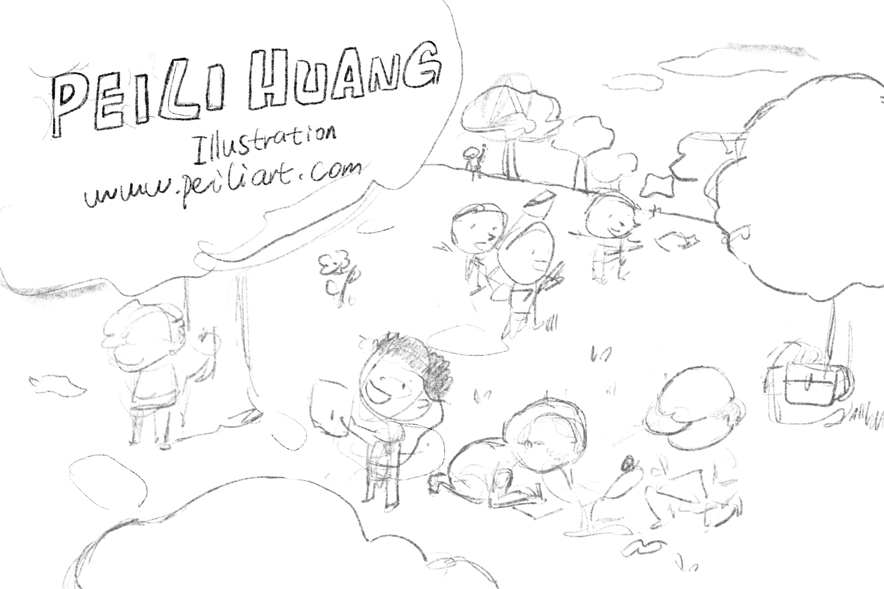
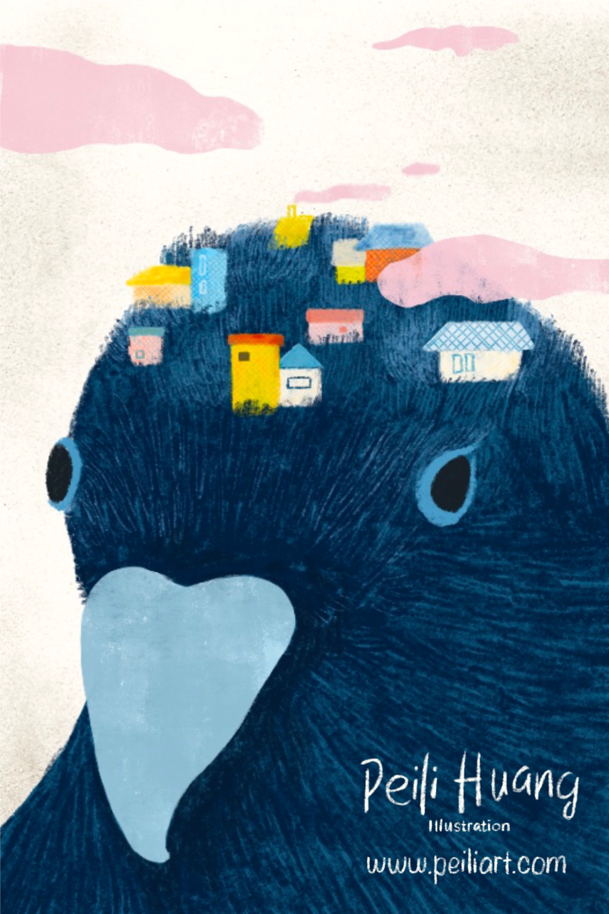
Peili Huang is a children’s book and editorial illustrator based in San Francisco. She is a mixed media enthusiast and animal lover. She loves to do art experiments every Saturday. Before coming to the United States, Peili was an electrical engineer in China. Realizing her real passion is illustration, she quit her job and began to learn illustration at the Academy of Art University. She graduated in the tough year of 2020, winning first place awards at the school’s annual spring show. As a freelance illustrator, she created children’s illustrations and designs for many satisfied clients such as Popshot Magazine, Dolphin Swim Institute, NetEase, etc. In February 2021, her first book THE GOLDEN ACORN TREE* was published by Room to Read. To her delight, the book won an award in the BELONG: TOV Creator Award category from SCBWI and was accepted into the Society of Illustrators annual book Illustrators 64. She is now working on a cute alphabet book for a client.
*Keep reading for a link to this book!
How do you choose the image(s) for a postcard?
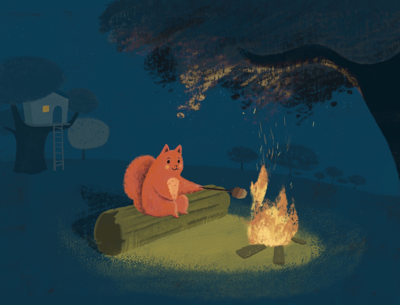
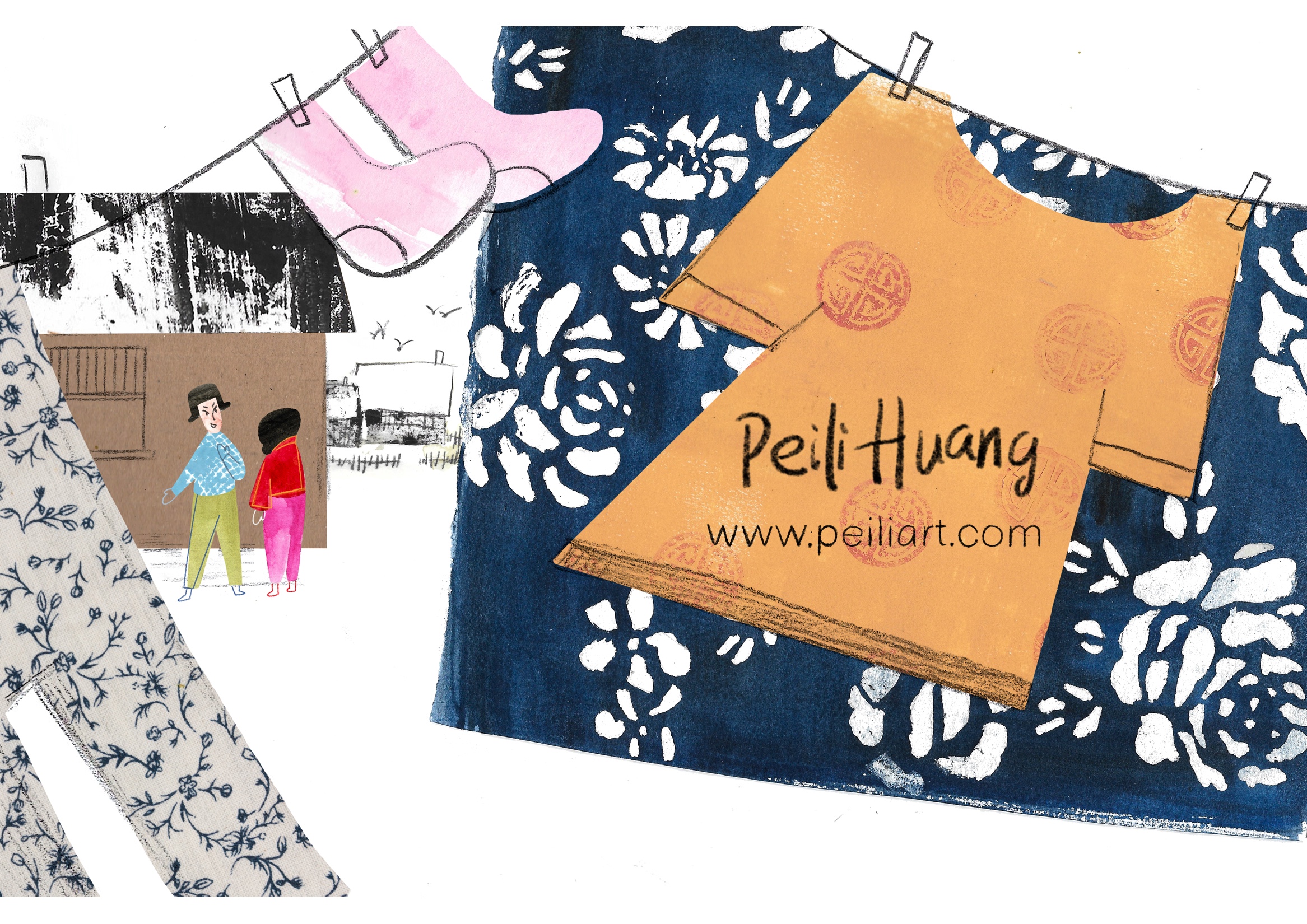
Basically, I choose from my best illustrations. Unlike my website, I can only choose two or three images for my postcard to print (considering the cost). I’ll definitely choose my most representative artwork to impress people. Among my best illustrations, I always choose pieces that have interesting elements which I can play with. For instance, I love the squirrel I created for my book and put an illustration depicting it roasting an acorn on the front. On the back, I illustrated the same squirrel collecting acorns, which explains where the acorns came from. Thus I delivered a simple story of a squirrel collecting and roasting acorns in one postcard. Another example is picking one with a distinctive pattern I created. Since it is important to be consistent on the front and the back, I put a similar pattern in the same color on the back, using it as a frame.*
*Excellent ideas for creating coherent designs.

Do you prefer text on the front of the postcard with the image or do you prefer all text on the back of the postcard?
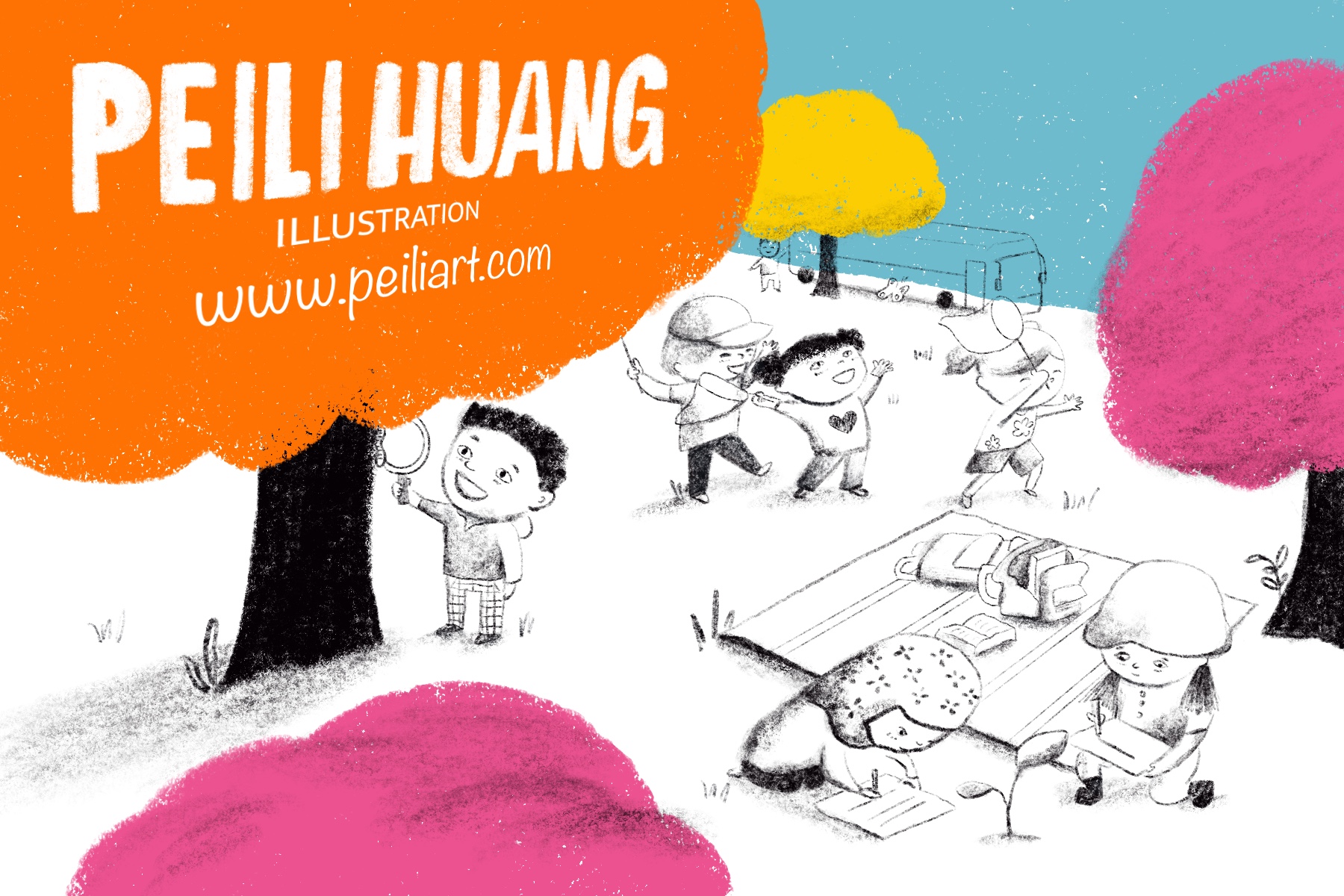
I prefer putting text on the front. Because I’m a children’s book illustrator and I’m always fascinated with the layout of each book page, there is usually room for text in my children’s book illustrations and I love how the words interact with images. It can be a lot of fun. But I would only put the most important information on the front such as name and website.
Do you create illustrations specifically for your self-promotion pieces?
Yes. Sometimes, it is hard to match the format of a postcard with my illustrations at hand. And sometimes, I really want to showcase all my favorite characters which might come from different stories. The process is like designing a book cover, you have to catch the audience’s eyes through beautiful artwork and typography. The big difference is your target: they are not kids but mainly art directors. You are creating directly for whom you want to reach— to attract their attention.
My teacher once told me, among her postcards, what brought the most attention was the one with kids. You have to show people, especially art directors, how well you can paint children and they love to see the diversity of kids. But I didn’t yet have any diverse kids illustrations in my portfolio, therefore I created one for promotional use.

Click on the gallery images above to see them bigger!
Some illustrators create a series of postcards and send them out over time. Do you create a series or stand-alone images?
I haven’t tried but it could be a good idea. I was thinking, if I haven’t heard from people I sent my first postcard to, what can I do to impress them in the second and third postcards? A series would be a good solution. They would definitely recognize my artwork in the second or third round and know how sincere I am. And they would also know my skill of sequence storytelling.*
*That’s true! Telling a story through sequential art is so important.
How often do you send out postcards?
Because of covid and most people working from home, I send out postcards once a year. With everything recovering to normal, I believe I’ll send more often. Maybe four times a year.
Who do you target with your mailings?
Art directors of children’s publishing and children’s magazines as well as agents of children’s literature agencies. Also I send editorial pieces to art directors and creative directors of magazines.
How do you compile your mailing list? Any tips on keeping a list and sending out?
I put my mailing list in google docs. Here’s a tip: you have to check the address on your list once in a while.* Especially before sending out your postcards. You can go to Google Maps to double check the address. Sometimes they change their working place and you’ll find it is said to be temporarily or permanently closed.
*Yes, researching and updating the list is absolutely necessary! Things change so quickly.
Do you have any tips on the production process?
I’ve been learning hand lettering recently because sometimes I’m not sure if it is ok to use certain kinds of fonts. With hand lettering, you have your own copyright of the font, which would be safe and unique. Also when putting different information together, I prefer using the same family font in different font type like bold, light, italic, etc. Before printing, remember to go to the printer to check their specifications like the size, dpi, colors, etc. You have to figure out every detail. Otherwise, your postcards would not be perfect.*
*Oh yes! Double, even triple checking is worth the time spent to avoid disappointment.
Do you use any online services? What are your favorite places to get postcards printed?
I was using Vista Print before. Vista Print is a good place, you can have a good preview of how it looks when printed.
Thanks so much for the tips and sharing your work, Peili!
See more from Peili, including her picture book:
Website: www.peiliart.com
Email: huangpeilipeili@qq.com
Instagram: @peiliart
Linkedin: www.linkedin.com/in/peili-huang-431b61184/
Children’s book: THE GOLDEN ACORN TREE: https://literacycloud.org/stories/3139-the-golden-acorn-tree/
If you’re joining us for the first time at The Postcard Post, you can catch up with a general article on postcard mailings for illustrators and previous featured illustrators in the archive(there’s a tab above too). And you can see recent posts by searching for The Postcard Post on this blog. See you next month.

Love your postcards!
LikeLiked by 1 person