The Postcard Post welcomes author/illustrator Andrea Tripke. Get ready to be wowed!
Andrea Tripke is a German born children’s book writer and illustrator. In 2003, she moved to the United States and has lived in Michigan, California, Ohio, Alabama and Florida. Her adventurous lifestyle paved the path for a somewhat different career and opened her up to follow the lifelong dream of becoming a professional artist. Andrea got a degree in fine arts, majoring in illustration, from the Columbus College of Art and Design.
She made her debut as a picture book illustrator when published by Ripple Grove Press. Excited about working in the children’s book industry and the thought of leaving a footprint behind through her books, she got hooked. She wanted to do more, and while working on a project, Andrea became inspired with the idea to write and illustrate her own stories.
Her first authored book MIRANDA, QUEEN OF BROKEN TOYS will be published by Black Rose Writing, February 2021.
How do you choose the image(s) for a postcard?
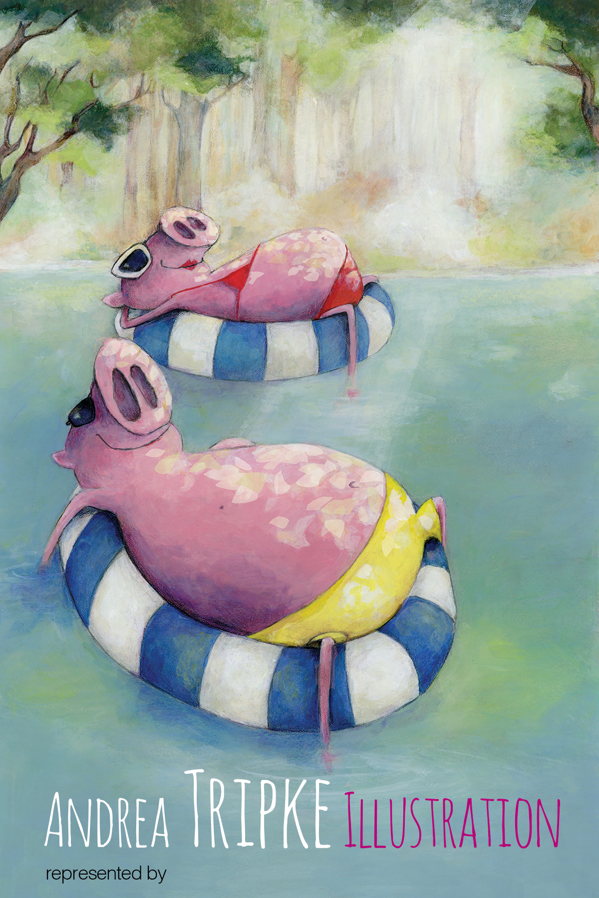
I try to think of an image that fits the children’s book market. If possible, showing 2 or more characters that show emotions and interactions and/or a certain atmospheric scene that sets a mood, such as mystery or loneliness.
The design should fit the (small) size of a promotional postcard. I have made the mistake of choosing illustrations that looked great full scale without considering how it will look in a smaller scale. Therefore, I started printing my illustrations in postcard size before creating the final promo piece. Lines and details become very delicate when resizing to a much smaller size…

size 4”x6”, printed on 14 pt. Gloss Cover with high gloss UV coating on the front
Do you prefer text on the front of the postcard with the image or do you prefer all text on the back of the postcard?
I like text on the front. Just the minimum information (name, website). There is always hope that a publisher keeps that card and looks at it from time to time. Wouldn’t it be fantastic if they remember my name? I keep all other information on the back. If the post card image is part of a book dummy, I’ll mention it on the back. I had publishers asking for a book dummy because they liked the image.*
*That’s fantastic. Great idea to really use the back of the card to promote specific work like a dummy.

Do you create illustrations specifically for your self-promotion pieces?
I usually pick my strongest/newest illustration making sure it includes specifics I mentioned above. If nothing fits, I do create an illustration specifically for my self-promo piece.
Some illustrators create a series of postcards and send them out over time. Do you create a series or stand-alone images?
I prefer stand-alone images. My thought is that each publishing house receives a ton of promotional material and the chances are they don’t remember my last card. Besides, with a series it’s always possible that a publisher dislikes the first one and will most likely dislike all others in that series… A lost opportunity. I try to keep it fresh and hopefully standing out from the masses of postcards.
How often do you send out postcards?
Usually 2-3 times a year but lately I’ve gotten carried away with other projects. There is just not enough time to keep up with everything. I am down to 1 per year but am motivated to increase it to at least 2.*
*It is hard to do everything all the time. Illustrators wear a lot of hats!
Who do you target with your mailings?
Children’s publishing houses are my main focus. I love illustrating children’s books! I use THE BOOK, the essential guide to publishing for children, which is free for members of SCBWI, and Children’s Writer’s & Illustrator’s Market as resources for my mailing list. Information about who is interested in artwork with specific instructions concerning who to send it to (editor, art director, etc.) can be found there or on the publisher’s website.
How do you compile your mailing list? Any tips on keeping a list and sending out?
I save all addresses in Microsoft Word, label format. Over the years I have taken out addresses and added new ones. It’s a mess! My once alphabetical order is now gone, and I end up going through all 200-300 labeled post cards to check that none is going out double or to the wrong address. Not the best way to do it!*
*Haha! Same thing happened to me. It’s hard to keep up with all the changes.
Do you have any tips on the production process?
• In Design would probably be the best fit for text but I figured that for a small-sized postcard, Photoshop works just fine. Printing companies usually provide guidelines for sizes and resolution. I recommend using their templates.
• My illustrations are done traditionally in mixed media. After scanning the images (300dpi), I touch them up digitally (if needed).
• For the promo cards, I pick clean and readable fonts. Not more than two different fonts— this includes the font used for the address labels. It helps to print out the final design including text before sending it off to a printing company. This way you can correct the font size and if necessary, pick a new font.
• I use standard postcard size (6″x4″, 4″x6″). Fancy sized postcards look great but will increase the postage cost— a lot! If possible, ask for a sampler kit from the printing company to determine the paper quality.
• It helps to pick a perfect match for your image (for example, glossy or matte finish). Matte finishes aren’t as vibrant but might look fantastic with an illustration that has a natural image. High gloss finishes tend to accentuate colors. My favorites are 14 pt. Gloss Cover with high gloss UV coating on the front and 16 pt. Premium Matte Cover. If you add high gloss UV, be aware that you won’t be able to write on it (other than with a sharpie).*
*Oh my gosh! So many excellent tips!
Do you use any online services? What are your favorite places to get postcards printed?
I like Gotprint.com. I have to stay within a budget and they have reasonable prices with good results.
A huge thank you to Andrea for sharing her wonderful postcards and amazing tips!
Check out these links to see more of Andrea’s work:
Andrea Tripke is represented by Joyce Sweeney and Marisa Cleveland: The Seymour Agency
Website: https://andreatripke.com
Facebook: Andrea Tripke Illustration
Twitter: Andrea Tripke
LinkedIn: Andrea Tripke
Instagram: Andrea Tripke
SCBWI Illustrator Gallery
Pinterest: Andrea Tripke
If you’re joining us for the first time at The Postcard Post, you can catch up with a general article on postcard mailings for illustrators and previous featured illustrators in the archive (there’s a tab above too). And you can see recent posts by searching for The Postcard Post on this blog. See you next month.

Gorgeous!
LikeLike
Love your art! Thank you for sharing!
LikeLike