I “met” this month’s illustrator on social media. I love taking walks with her in her Instagram stories— a sure pick me up with her delightful take on things and cheery posts. I’m pleased to present illustrator, Kristine Lombardi!
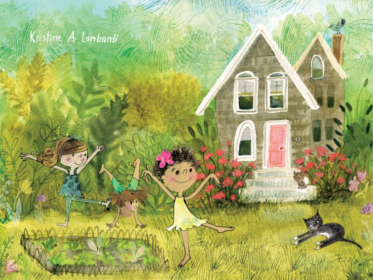
Kristine Lombardi is an illustrator, surface designer and author of three picture books for children. She lives 12 miles west of Manhattan in a lovely town called Montclair. She spends most of her time creating art in her sunny studio under the watchful eyes of her calico cat Boo. Kristine delights in anything from the early sixties-vintage picture books, vinyl records, toys and random ephemera. She also finds inspiration on her long walks in the neighborhood and in NYC. She’s a huge animal lover and tends to prefer them as characters in her books.
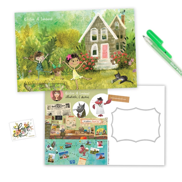
How do you choose the image(s) for a postcard?
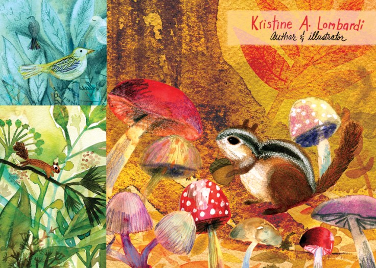
It depends…I usually choose seasonal themes— maybe a funny pool scene just ahead of summer or a charming autumn image to mail out around back-to-school time. I also get feedback from social media to see which images are garnering the most engagement.
Do you prefer text on the front of the postcard with the image or do you prefer all text on the back of the postcard?
I generally (aside from my name) put text on the back of postcards. But I do think an illustrator should put their name on the front should you have the good fortune of being hung on an editor’s wall! (And that often happens, by the way. I once got a call from someone who said they loved my postcard. I asked which one it was and it turns out it was FIVE years old! So you never know!)*
*Oh my gosh! I love this story.
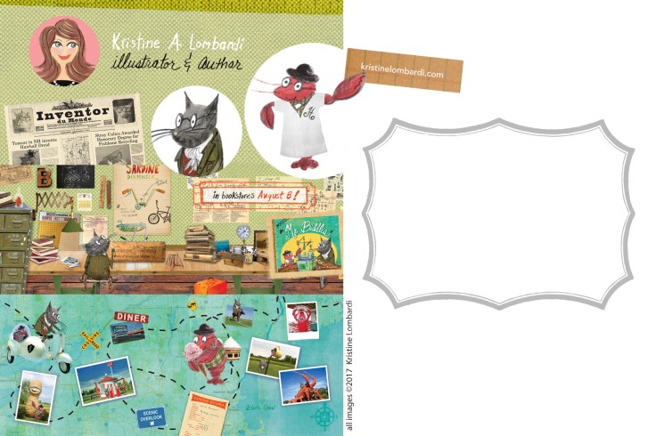
Do you create illustrations specifically for your self-promotion pieces?
Most of the time, these images are ones that I have already created. Sometimes they are a collection of illustrations that either complement each other in terms of color palette or all have the same sensibility and style.
Some illustrators create a series of postcards and send them out over time. Do you create a series or stand-alone images?
I have done a series at times, but there is a lot of turnaround in publishing so even if you do that, someone else may be receiving your next postcard in the series. So I tend to lean toward individual mailings.
How often do you send out postcards?
I try to send out at least twice a year but optimally I would aim for quarterly. Postcard mailings can get expensive so I try to supplement with email blasts.*
*Ooo! Good idea.
Who do you target with your mailings?
I tend to mail to children’s publishers but send e-campaigns to other lists such as editorial, PR and advertising, but I don’t do as much work with those areas as I once did.
How do you compile your mailing list? Any tips on keeping a list and sending out?
I create different lists in my email service. I prefer MailChimp. It’s easy to use and you can monitor all sorts of data such as opens, clicks, etc. I must admit it is a constant challenge to keep those lists current so you really have to incorporate this type of work into your schedule. It’s not as fun as your time at the drawing table, but if you are self-employed it is vital to your business. Companies need to know you are out there. If you have an agent, they do much of this promotion for you but even with one, I used to promote! Also, I try and make the process of sending these fun, so I like to handwrite addresses with colorful pens. It’s all about the new “school supplies”! ;)*
*Haha! Nothing like the smell of fresh school supplies in the autumn!
Do you have any tips on the production process?
Keep the design clean and readable. I used to be an art director and I remember my boss getting after me for tiny type! Well, I think he still would do so today. Lol! I still make the mistake of using a 10 or 11 point font on the backs to list clients or contact info, but honestly, it should be 12 minimum! And now that I am of a certain age, I find it frustrating to try to read teeny tiny fonts. You don’t have to make it big either but you want it readable. Oh, and don’t put anything important in pale pink. ( I never did that EVER. It was a friend.)* You want your contact info to jump off the card!
*Hilarious! Our favorite colors are so tempting.
Do you use any online services? What are your favorite places to get postcards printed?
I have used all sorts of printers from local to online but I tend to keep coming back to Vistaprint for postcards because they have the best sales on their products. I never pay full price, but wait until I get the next email saying everything is 40% off and then I pounce! If you continually prepare materials for your mailings, you can really work fast when those sales come up and get multiple runs completed.* I never print more than 100 after years of extra postcards laying around. I love trees and despise wasting paper. Keep your lists updated and mail only to those who would hire for what you are sending out.
*Such a good point. It’s frustrating when the sales arrive and there’s no new postcard.
A great big thank you to Kristine for sharing her illustrations and tips.
See more of Kristine’s work here:
Website: Kristinelombardi.com
Twitter: illolombardi
Instagram: illustrationlombardi
Facebook: Kristine Lombardi, Illustrator & Author, @lombardi.illo
If you’re joining us for the first time at The Postcard Post, you can catch up with a general article on postcard mailings for illustrators and previous featured illustrators in the archive (there’s a tab above too). And you can see recent posts by searching for The Postcard Post on this blog. See you next month.

Amazing interview!! Thank you!!
LikeLike