Sub It Club welcomes Dow Phumiruk to The Postcard Post. Sit back and enjoy her illustrations and tips.
Dow Phumiruk joined SCBWI in 2011 and has been creating children’s book art and stories ever since. As an artist, she works digitally, but she loves to experiment with other media whenever she can. She lives in Lone Tree, Colorado with her husband, daughters, and an assortment of small pets (most notably a dwarf rabbit named Lottie and a cute bearded dragon named Sparkles).
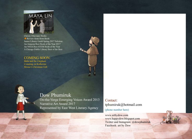
Dow’s big break came when she met Deborah Warren of East West Literary Agency at her local SCBWI conference. Soon after signing with Deborah, she received an offer to illustrate MAYA LIN: ARCHITECT OF LIGHT AND LINES (by Jeanne Walker Harvey, from Christy Ottaviano Books). This book was a Junior Library Guild Selection, an Amazon Best Book of 2017, and has received a Horn Book starred review. Look for her upcoming projects: MELA AND THE ELEPHANT, COUNTING ON KATHERINE, and MOUSE’S CHRISTMAS GIFT this year.
How do you choose the image(s) for a postcard?
I look for images that are a good representation of my children’s book style. I only recently found that style, having started illustrating a little later in life. It took about 4 years to emerge and solidify.*
The characters pictured, the composition or illustration style, the color scheme: something about that postcard you create should be recognizable as your work. Ideally, I’d like for my audience to want to see more! Is there an intriguing hint of a story idea or a winsome character on your postcard? More than a few times I’ve heard of success stories from nothing more than art on a postcard mailing!**
*Patience pays off. Good reminder to stick with it.
**Ahh! Those are the best stories!
Do you prefer text on the front of the postcard with the image or do you prefer all text on the back of the postcard?
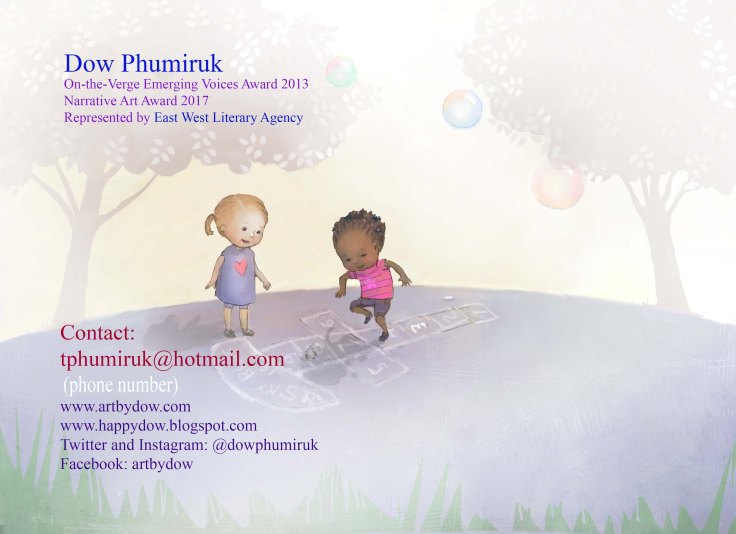
I am a fan of text on front and back! I imagine my postcard like a book cover: a title on the front and more information on the back. In the case of my postcard, it’s my name and website on the front, and all contact information on the back.
Do you create illustrations specifically for your self-promotion pieces?
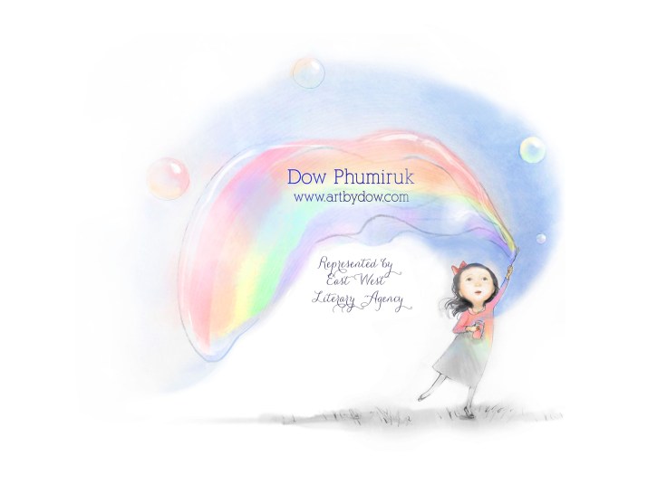
On occasion I have, but not usually. I draw a new image almost every week, so I have several that come in the running for postcard art. The postcard above has images I came up with for Inktober (every October, a community of artist draw daily works in ink and share them on social media). The postcard below was created from my entry to the SCBWI Narrative Art Contest. You can see how I incorporated the art to fit the postcard back.
Some illustrators create a series of postcards and send them out over time. Do you create a series or stand-alone images?
Mine have all been stand-alone. I enjoy drawing and sharing a range of composition and characters, so I don’t think I could stick to one series for postcards. But if you have a strong and memorable character set that you’d really like to see published, this could work well for you!

How often do you send out postcards?
I used to send them out regularly ‑ every 3-6 months ‑ while actively seeking projects. Of late, I’ve used them for promotion at conferences.
Who do you target with your mailings?
I’d send them to specific editors and agents whom I’ve read about or met and feel would be a good fit for me. My current postcards are targeted to a broader audience: the editors and art directors who will peruse the SCBWI Portfolio Showcase in New York City.
How do you compile your mailing list? Any tips on keeping a list and sending out?
I made a chart/spreadsheet on my computer to keep track. You really must have a system, as it’s very easy to get confused about what you’ve sent and when/where you’ve sent it!*
*So true! It can be quite a job keeping track of everything.
Do you have any tips on the production process?
I illustrate in Photoshop, mostly. Lately I’ve had success with a multiple step process for art:
1. Sketch with pencil on any paper (I may or may not color it with watercolor);
2. Take it to Photoshop for editing and more coloring;
3. Print it out on regular printer paper;
4. Ink edges;
5. Put it back into Photoshop to finalize.
Of note, I don’t use any fancy paper or scanning since I finish the art digitally. I just take a picture with my cell phone usually! If I’ve lost too much of my paper texture after digitally editing it, I open my file folder of textures (I’ve collected these over time) and choose one to place as another layer on top (changing the layer to “overlay” type so it’s mostly transparent).
My file size is about 7.5″ x 10″ and 300dpi, with largest font at about 20-point size and smallest font 10-point. Don’t go too small — it’ll be hard to read!*
*Such helpful info! Especially for those who’d like to try working in Photoshop.
Do you use any online services? What are your favorite places to get postcards printed?
I’ve really enjoyed using Vistaprint. They’ve been receptive to any issues that have come up (once I ordered a deluxe paper that I assumed was glossy but instead was rough like heavy watercolor paper, and another time my art was too dark upon printing — both of these issues were handled with great customer service and reprinting free of charge) and their prices are pretty good. They do generally print a little darker than what I submit, I’ve found over the years.
I still haven’t tried Moo.com, which is what many artist friends have raved about. Eventually I’ll try it for the nice rounded corner option (though I imagine editors aren’t hurting themselves on sharp postcard corners…).*
*Ha ha! You never know!
A big thank you to Dow for sharing her lovely images and helpful tips!
Check out more of Dow’s work here:
Website: www.artbydow.com
Blog: www.happydow.blogspot.com
Twitter: @dowphumiruk
Instagram: @dowphumiruk
Facebook page: ArtbyDow
If you’re joining us for the first time at The Postcard Post, you can catch up with a general article on postcard mailings for illustrators and previous featured illustrators in the archive (there’s a tab above too). And you can see recent posts by searching for The Postcard Post on this blog. See you next month.

Thank you so much for having me here. I had fun answering these questions. Good to all who are with me on this mission to create books for children!
LikeLiked by 2 people
Sorry, I meant good LUCK to all! 🙂
LikeLike
Love your illustrations. Thanks for sharing.
LikeLiked by 1 person
Thanks for sharing, Dow! Great tips here. I love the way you integrated the text into the flashlight beams on your postcard. Also love that you’re a bunny person, too!
LikeLike