So you want to build a portfolio website.
In Part 1, we discussed fantastic website hosts and where to find them. Hopefully by now you know how to set up your website. Now we’re going to discuss what to put on it. I mean: your art, obviously. But what’s the best way to arrange it to keep an art director’s attention and not make them wander away to look at some other artist’s excellent portfolio website? What other necessary content does your website need?
Three Points of Information
Aside from your art, your website should include three important bits of information: your name, your bio, and how to contact you.
Your bio can be short and sweet, and include as much or as little information as you want, as seriously or as wackily written as you want. Think of this like the author bio that you often see on the inside jacket of books (and hey, maybe read a few author bios to get the creative juices flowing). Your goal is to give visitors a sense of who you are. Include the information that pertains to your work as an artist: where you’re from, where you’ve been, how you honed your skills, your pets, previous clients, what inspires you.
Your contact info does not need to include your mailing address or phone number. Your e-mail address is just fine. Make sure it’s easy to find: you can have a contact page, or you can display your e-mail on the home page. Or both!
Some artists like to use an e-mail form rather than post their e-mail address. That’s fine too, but consider: some directors and recruiters want a record of the e-mails they’ve sent, and sending a message through a form won’t provide that. You can keep the form, but consider having your e-mail address on the website as an option.
Function Over Form
Your website’s layout should prioritize art. There are a lot of cool, eye-catching design options for websites, but remember that visitors are not coming for your web design skills. They want to see art. Avoid anything flashy; and avoid Flash, for that matter.
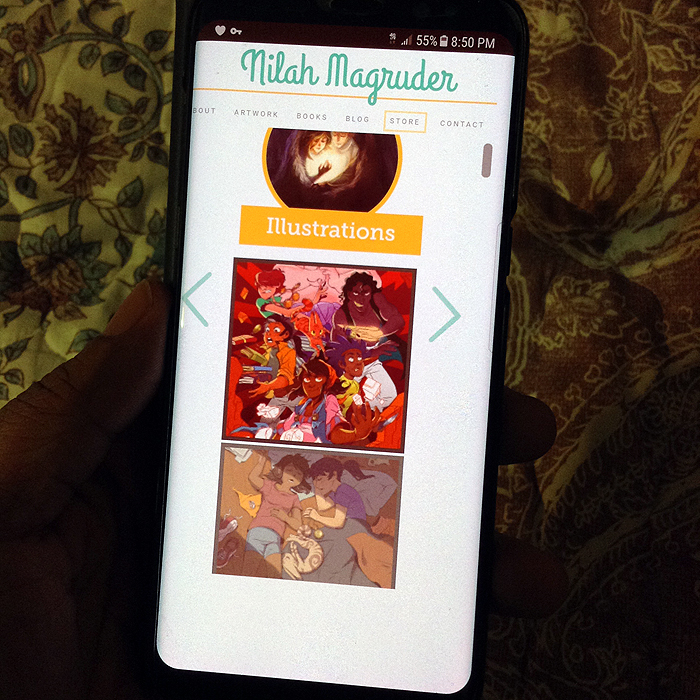
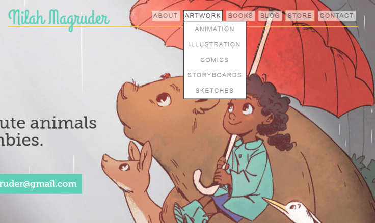
My general guideline for a portfolio website is one-click navigation. A visitor should be able to find whatever they’re looking for in one click or less. Art? One click. Contact information? One click. If you make visitors hunt for the content they’re looking for, you risk losing their attention. Figure out how to organize your content in a way that directors and recruiters are able to find what they’re looking for in the least amount of time possible.
As far as how to organize your art, you have a number of options. Some website templates arrange art in a grid. Some websites scroll. I suggest using thumbnails rather than text links or full images. They load quickly and give visitors a chance to see your art at a glance. Thumbnails should expand to the full image when clicked, either within the tab or in a separate window or tab. Shadow box layouts—which open the image over the webpage, usually with a darkened background—are also popular for portfolio websites. All of these formats are acceptable. Take some time to scroll through the websites of various artists and pay attention to the features that appeal to you.
Flexible Design
Nowadays we view the Internet on a variety of screens; desktops, laptops, mobile phones, tablets. Art directors and recruiters are no different. A website should be adaptable to a range of screen dimensions.
How do you ensure that your website is readable on different screens? You check. View your website in different browsers, different devices, different platforms and operating systems.
Borrow friends’ devices. Go to any big box electronics store that has a bunch of display models. See where the website breaks and why. Examine borders, line breaks, fonts, and images. If your website doesn’t appear quite like you want it to in a particular resolution, go back to the code and see what can be changed to make it work.
Thankfully, some templates already have built-in flexible design. If you’re using a service like Wix or Weebly, check their templates on multiple screen resolutions to see if they suit your needs. If not, try other templates until you find the functionality you’re looking for. WordPress has a built-in feature that enables you to check your website on various resolutions without ever leaving your browser.
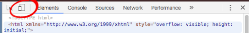
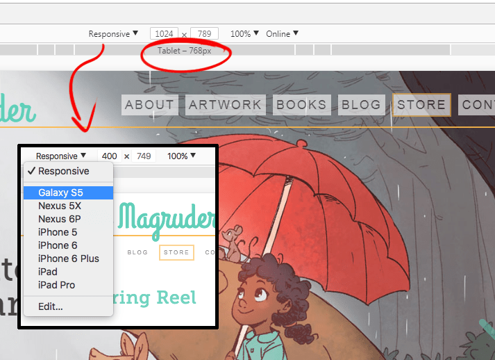
Chrome also allows you to check different screen resolutions within the browser. From the website you’re working on, right-click and select “Inspect” (Ctrl+Shift+I). This will bring up the Inspector panel. Then, select the device icon (see the image above). This new view will allow you to toggle between resolution options.
Organization & Focus
Know the type of jobs you’re looking for, and target your portfolio to them. Your portfolio should demonstrate your proficiency in whatever discipline you’re interested in. If you’re submitting for picture book illustration, be sure you have sequential picture book pieces with a focus on children and animals. If you’re interested in comic illustration, your portfolio better have comic pages.
You might want your portfolio to include a project (or several) that is a series of illustrations, like a comic or a picture book. There’s no best way to approach this, but I’d suggest keeping related images together. You can even separate these images from your other standalone pieces and place them under their own header. If you’re hosting your portfolio on Behance, it already offers a way to upload images by project.
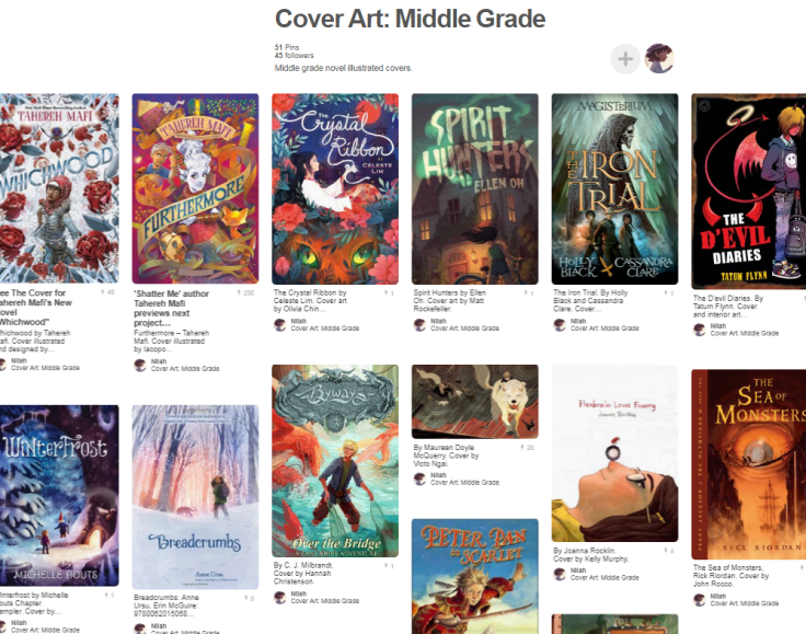
If this is your first portfolio and you’re not sure what’s appropriate for your discipline, a bit of research might be necessary. Take a look at the portfolios or artists who are doing the type of work you want to do. If you don’t know any, go to the bookstore, or the library, and look at the books on the shelves. Take pictures and make your own reference catalog. For instance, I keep a Pinterest board that’s just illustrated middle grade covers.
How Much Is Too Much?
There’s no firm answer on how much is the right amount of art to showcase on a portfolio site. It’s different for every artist, but the adage “less is more” definitely applies to all. Your website should showcase your very best work; or at least, it should showcase the work that best exemplifies the kind of work you want to do. With that in mind, 4-10 strong pieces is a good ballpark for a portfolio website. Don’t overload your website in an attempt to seem prolific. Art directors don’t have a lot of time and would much rather see 4-5 strong pieces than 15-20 mediocre ones.
So, as you’re reviewing work to decide what goes on your website, be honest with yourself. Which pieces best reflect the work you want to do? And remember, chances are that as you continue pursuing your art, you’ll produce newer and better work. You can update your website at any time to add new pieces and discard old ones that no longer reflect your skill level.
So Many Styles
When designing a portfolio website, it’s best to be specific, but that doesn’t mean sacrificing your range in favor of a narrow focus. Some artists work in a variety of media, styles, and industries that do not always relate closely to one another. If you work in multiple styles, or want to target multiple disciplines, the best option is to keep these categories separate in your portfolio.
For instance: you want to illustrate children’s books, and you have black and white ink drawings, traditional paintings, and digital paintings. Separate into three categories: black and white, traditional, and digital. This way, directors can target what they need and see how you work in each medium.
Or, you’re interested in children’s books, comics, and cover illustration. Each area needs to show a different skillset: your children’s book illustrations are not necessarily suitable as comic book samples, and your beautifully rendered cover paintings do not hold the sequential storytelling necessary in comics or children’s books. Once again, compartmentalize and separate this art into sections.
Keep It Updated
Sure, setting up a CMS, learning HTML and CSS, and formatting images can be hard, but by far the hardest part of a portfolio website is keeping it up-to-date. Once the website is up, it’s very easy to forget about it and let it become static. And it’s hard for a busy artist to find the time to update art and information. But alas, it is something you must endeavor to do. As time passes, you will grow as an artist, and you want your website to always reflect your current level of skill. Be sure to visit your website every six months or so to see what can be added, updated, or removed.
Now you’re on your way to creating a memorable portfolio website! Special thanks once again to Deborah Kim and Sarah O’Donnell for providing their expertise to this blog post. If you have questions or suggestions, feel free to leave them in the comments!
