The holidays are upon us and no matter what you’re celebrating, it’s fun to see seasonal postcards. This one caught my eye on twitter and illustrator Emily Wayne graciously agreed to drop by and share her fun illustrations and tips with us.
Emily Wayne is an artist, illustrator and all around crafty sort (in the creative sense, of course) based in the beautiful Pioneer Valley of Western Massachusetts where she lives and works with her family and her menagerie of animals that includes a Chihuahua, a tabby, a Norwegian Forest Cat, an African Pygmy Hedgehog and assorted fish. She is a kitty lover, a hedgehog enthusiast, obsessed with Alice in Wonderland, and may or may not be related to Batman – shh!
How do you choose the image(s) for a postcard?
This is always a tricky thing – there are a lot of factors that come into play with promotional postcards. First and foremost, you want to put your best foot forward – something that really highlights your abilities, showcases your style, but also something that you really LOVE to do, because you want to get work you really LOVE doing! You want to consider what an art director might be interested in, something that’s relevant or marketable, something that will appeal to your target audience. And you want something that will pop, that will catch their eye and make you stand out from the hundreds of other postcards on their desk. It’s a daunting task!!* I try to keep all of this in mind, but also tend to overthink a lot! I worry that I need to be able to do everything, encompass all styles and subject matter, which is of course crazy – so when I start to get bogged down I always go back and ask myself if I really LOVE it, because to me that’s the part that matter the most. Does it look and feel like ME? Is it something I’m excited about? I like to think that when I really LOVE what I’m doing, it shows through and gives my work heart, and that hopefully that will be enough to make someone else love it too.**
*It is!
**So true. The love shines through.
Do you prefer text on the front of the postcard with the image or do you prefer all text on the back of the postcard?
Personally I like the front to be as clean as possible – all eyes on the art! But I’ve often heard that it’s always a good idea to have at least your name and website visible on the front, that way if an art director likes it and has it hanging on their wall, they don’t have to flip it over to see who you are. You want to make it as easy as possible for them to remember you, and find you! If your name and website are right there on the front, they can look you up fast! With that in mind, I always have my name and website on the front of my postcards, but I keep all other information for the back.

Do you create illustrations specifically for your self-promotion pieces?
If I have an idea that I really love then I like to create the illustrations specifically, but if I have something that I think will work well on a postcard then I’ll use that. This is actually the first year that I’ve sent out mailings.
When I sent out my first postcard last January, it was intimidating, trying to pick just the right image. I had a piece to use but something about it just wasn’t right and I kept putting it off. In the meantime I had been doing some hedgehog sketches that I really loved and when I showed them to a few of my friends, they all agreed – use the hedgehog! It goes back to that comment I made earlier about loving what you do – I love drawing animals, I LOVE drawing my hedgehog (I actually do have a pet hedgehog), and that makes it all the more appealing because you can see that love come through. I sent out my second mailing in late spring, after the New England SCBWI conference. I wanted to make sure I got them out before it had been too long, and that the people I had met at the conference would remember, so I used the piece I had created for the conference Illustration Challenge. At the end of the year, I knew I needed to get one more out.
This postcard is actually an experiment for me. When I sketch I love to use Copic markers, and I get a lot of positive response to my sketches – but to me, they still feel like “just sketches.” In October, I did Jake Parker’s Inktober challenge using a list of seasonal prompt words. This sketch was the most popular and a peer commented that I should send out a postcard with my Copic work so this postcard was born from this sketch.

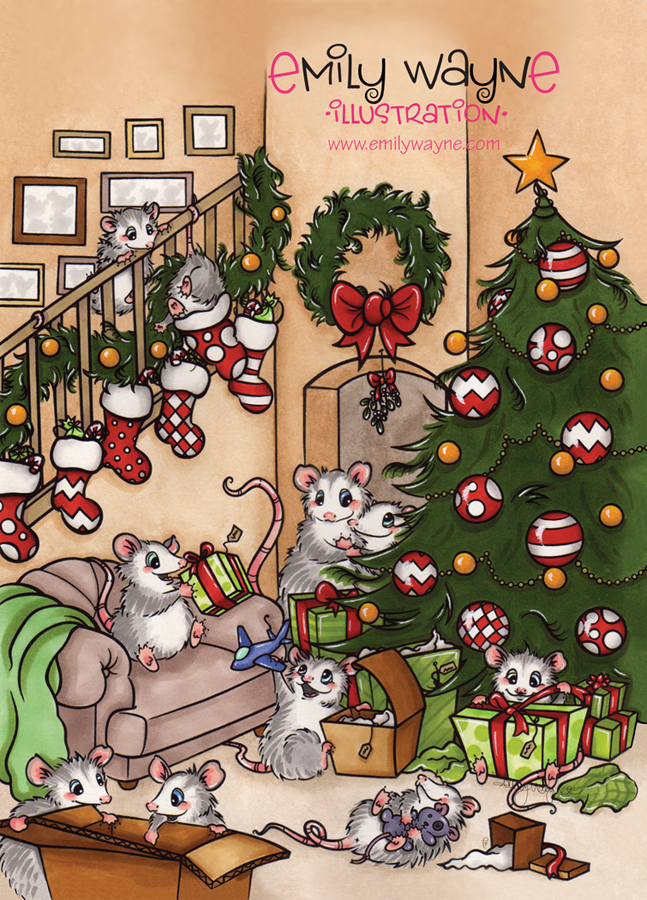
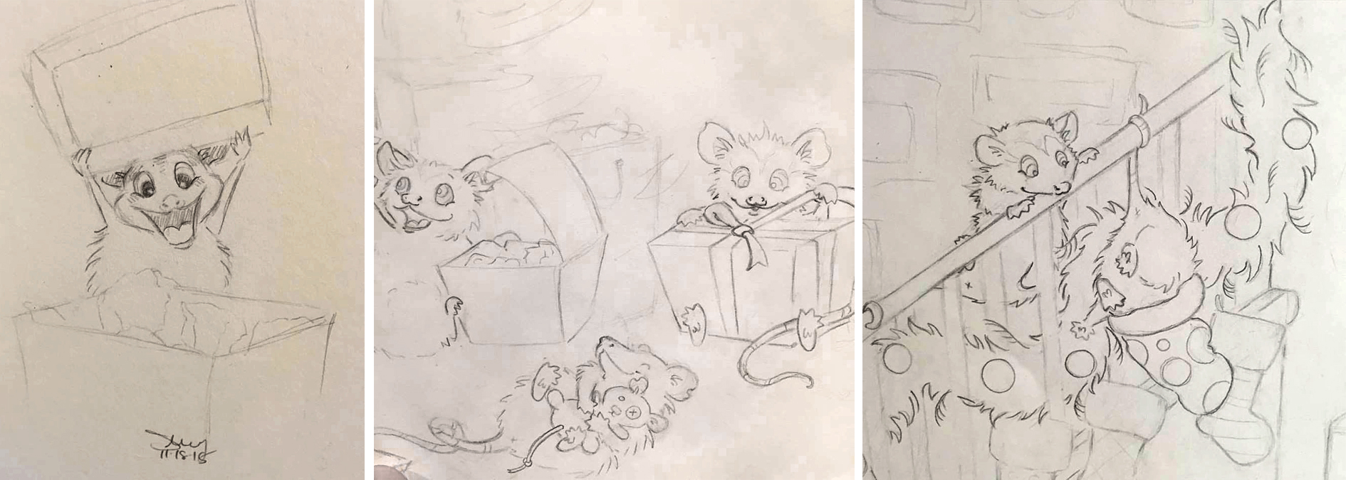
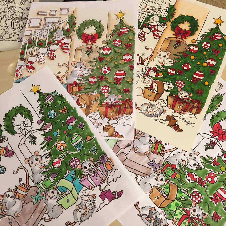
Sometimes my finished work gets too tight, whereas these sketches are full of energy.* But having a peer validate that this IS finished work and not “just sketches,” really pushed me. She had suggested using my possum as a spot on the back and kids picking pumpkins on the front for something more narrative but I realized I wouldn’t have it done in time for Halloween. So I started sketching a possum family on Christmas morning! I loved the idea of a busy Christmas morning scene on the front, and a Mommy Possum on the back, relaxing with her tea after all the hustle and bustle. She actually didn’t change at all from that first sketch (though I did flip her, it looked much nicer to have her facing the text, almost like she’s framing it as another scene). I shared a lot of process sketches while I was working on it, and the response was so positive that I took the line work and made it into a downloadable coloring page on my Etsy shop, so people can color their own version!
*A lot of illustrators struggle with this. I think you were very brave to experiment–with great results too!

Some illustrators create a series of postcards and send them out over time. Do you create a series or stand-alone images?
I haven’t done this yet, though my first two postcards did feature a hedgehog character (he’s definitely a recurring theme in my work!). But I do love the idea of doing a series, either released one after the other as a narrative, or a group at a time like with trading or collectors cards!* For now I’m doing stand-alone images, but there may be a series in the works at some point in the future!
*Fun!
How often do you send out postcards?
This is the first year I’ve done a mailing! My goal was to send out three times during 2015, and I made it!* Three times a year is generally considered to be a good amount, and my goal is to do at least that.
*Congratulations! That is no small accomplishment.
Who do you target with your mailings?
My list is primarily made up of the major publishing houses for children’s publishing. I send to editors, designers and art directors. Now that my mailing list is fairly established and just need to maintain it, I need to start expanding to smaller and independent publishers, and magazines. I’m also going to be looking into licensing as I think my work would be a great fit for it.
How do you compile your mailing list? Any tips on keeping a list and sending out?
I started my mailing list by reading SCBWI’s The Book which is available to members– it’s such an invaluable resource! I also looked through The Children’s Writer’s and Illustrator’s Market.* From there I looked at websites, at what places I thought my work would be a good fit. Then I researched individual names, whether they were still in their current position, what type of work they look for, etc. I keep my list as a Word spreadsheet – probably not the most efficient (I’m sure there are better ways to do it) but it works for me. Whenever I’m planning to do a mailing I go back and double check that addresses and positions are still current. For that I tend to look at LinkedIn or Twitter, most people have a strong online presence so it’s easy to verify.**
*Two excellent resources.
** Great advice!

Do you have any tips on the production process?
I use Photoshop for just about everything. Once I’ve finished my art, I scan it in, usually three to four hundred DPI, and I open it up in Photoshop to clean up (fixing smudges or mistakes, erasing the inevitable cat hair that ends up everywhere*…). I use downloaded postcard templates and arrange the image and text in layers so I can play around with the positioning until it looks right. I made a vector file with my logo and social media icons in Illustrator, so that I can resize it however I like without worrying about it getting pixelated. It’s easy for me to open it in Photoshop and drag it onto it’s own layer. I use the same font for everything (postcards, business cards, website, etc.) so that it will all have a unified look. Once everything looks good to me, I merge the layers, flatten the image and save it as a JPEG and upload it for printing!
*I think the cats are hinting that they want to feature in your next postcard.
Do you use any online services? What are your favorite places to get postcards printed?
I’ve used both Overnight Prints and Vistaprint and been very happy with them. I stick with Overnight Prints for my business cards because they offer rounded edges and I really like that look. For the postcards I tend to go with Vistaprint: they’re not terrible expensive (and they offer Groupons a lot which is great), they ship quickly, and I’ve always been really happy with the way they come out.
Thanks for having me, Dana!
Thank YOU, Emily! I enjoyed your post and your enthusiasm is infectious.
Check out the rest of Emily’s work in these places:
Website: http://www.emilywayne.com
Facebook: https://www.facebook.com/emilywayneillustration/
Instagram: https://www.instagram.com/emilywayneillustration/
Twitter: https://twitter.com/emilywayneart
LinkedIn: https://www.linkedin.com/in/emily-wayne-42605038
Etsy: https://www.etsy.com/shop/emilywillustration
If you’re joining us for the first time at The Postcard Post, you can catch up with a general article on postcard mailings for illustrators and previous featured illustrators in the archive (there’s a tab above too).
See you next month.

The Valley is certainly an area rich with writers and illustrators! Hope to meet you, Emily, at the next NESCBWI conference. Bring pictures of the cat and hedgehog!! 😉
LikeLike
It’s such a wonderful area! Hope to meet you too! I never have a shortage of pictures of them!! 😉
LikeLiked by 1 person
I loved the illustration and the story of its development! I envy the gift you have to do this, Emily!
LikeLike