I came across this month’s featured illustrator first at the SCBWI Summer Conference Portfolio Showcase and then through social media. Sub It Club welcomes illustrator Amber Alvarez to The Postcard Post. Enjoy!
Amber Alvarez grew up on a white strip of sand bordering the Pacific Ocean. While other kids had cats and dogs, she had a pair of green sea turtles. Amber holds a BFA in film from Pratt Institute in New York City; where she lived out many childhood dreams — among them, strolling to Sesame Street for work. After calling Brooklyn home for nearly half her life, she now she makes picture book art in her tree house in Utah’s gorgeous Wasatch Valley. Amber is a recipient of the National 2017 SCBWI Mentorship Award. She has thrilling picture book news that she can’t wait to share (but must!)*
*Ahh! The suspense!
How do you choose the image(s) for a postcard?
I gift myself two “New Years” annually. The first is on January 1st, the second is the eve of the L.A. SCBWI Conference. I start a brand new art folder on each of those days. Every time I start fresh, I look back over six months of recent personal work and see a subconscious theme naturally shaping. I pluck a piece that’s most representative of my recent work for my conference post-card. I use that theme to update my portfolio and drive my postcard images for the next six months.*
*Wow. That’s an interesting approach.
Do you prefer text on the front of the postcard with the image or do you prefer all text on the back of the postcard?
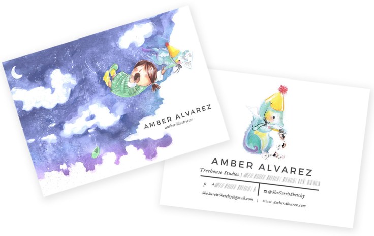
While aesthetically nothing pleases me more than white space, I keep my candle-of-non-stop-hope burning bright by slapping my name on every possible surface.*
*HA! You get the prize for the most original answer to that question. 🙂
Do you create illustrations specifically for your self-promotion pieces?
One of the greatest prizes that came with last year’s SCBWI mentorship award was a bevy of talented peers that are magically just like me – women who’ve made art their professional careers and who are laser-focused on transitioning into picture books. We’ve since started a quarterly mailing we do together, six images on one long postcard, four images on front, two images on back. We pick a theme and a color palette. I do new illustrations for that mailing.

Some illustrators create a series of postcards and send them out over time. Do you create a series or stand-alone images?
I like showing a variety of images. If an art director loves a character or illustration with their whole heart, I trust they’ll call when they have a good match for me. If they haven’t called, I’d rather send them something fresh. I always use the same font and layout. I include two different but matching illustrations, (one on each side). Art directors have told me that the way I set up my postcards lets them know they’re mine before they’ve registered my name and website.

How often do you send out postcards?
Mailing postcards with my SCBWI friends has made a huge difference. Our group mails postcards quarterly. I send out one more on my own, either for Thanksgiving or Valentine’s day. I also design a new card for every SCBWI conference.*
*That’s a lot of postcards! Bravo!
Who do you target with your mailings?
I’ve been thinking about designing a specific mailing for editorial work. Now that I’m making my own art full-time I finally have room to take on those kind of exciting gigs. So far, I sent my personal mailings to the same people we send group mailings to, publishers, editors and art directors I admire.
How do you compile your mailing list? Any tips on keeping a list and sending out?
I use THE BOOK, as a base, adding experts I hear at conferences, and art directors or editors I research when a picture book they’ve helped into the world stirs my soul. When the SCBWI mentee group started doing our quarterly subs, we pooled our lists to make a super list. It’s a google-sheet. We print mailing labels from it directly, allowing each of us to update it on the fly.*
*That sounds very efficient.
Do you have any tips on the production process?
I always begin a sketch with a carmine red pencil (cyan blue works too.) Once I’ve figured out all the kinks, I draw over the top with a graphite pencil (I’m a Palomino Blackwing evangelist). Once I’m finished, I drop out the red in Photoshop. The result is an energetic sketch that looks effortless. To do it, scan in your art into Photoshop in RGB mode. Add a black and white adjustment layer over the top (Image >Adjustments >Black and White) and use the color toggles to drop the color underneath out to your preference. Voilà!*
*You make it sound easy— but I’m sure it isn’t!

Do you use any online services? What are your favorite places to get postcards printed?
I use Vistaprint frequently, their prices and customer service are great. We use GotPrint for our group mailings. I was overwhelmed by the print quality of the larger Moo cards at this year’s conference. I just ordered my most recent haul from them and I can’t wait to have them in hand.*
*Can’t wait to get my hands on one too!
A great big thank you to Amber for sharing her illustrations and unique tips.
Keep up with Amber’s work here:
Website:www.AmberAlvarez.com
Twitter:@shesureis
Instagram: @shesureissketchy
If you’re joining us for the first time at The Postcard Post, you can catch up with a general article on postcard mailings for illustrators and previous featured illustrators in the archive (there’s a tab above too). And you can see recent posts by searching for The Postcard Post on this blog. See you next month.

Thank you, Amber, for sharing your illustration journey. Love your work!
LikeLike
Your work has such energy. Beautiful!
LikeLike