Sub It Club welcomes Priscilla Tey (all the way from Singapore!) to The Postcard Post. Priscilla shares some tips, wonderful illustrations, and an obsession.
Priscilla Tey is an illustrator and picture book maker. A graduate of the Rhode Island School of Design (RISD), she loves woolgathering, writing stories and being the architect of wonderful worlds that characters wander in. She keeps her sheep obsession at health levels and balances that off with her fascination with gnomes. She has a strange affinity for staircases and finds that the world is full of strange adventures waiting to be excavated.
Priscilla currently resides in her native country of Singapore. Her first picture book IN-BETWEEN THINGS will be released worldwide under Candlewick Press in May 2018. Her work has also been featured in various publications including Plansponsor and Spider Magazine. She enjoys working in both traditional and digital media, and often combines both in her process. She is currently working on her second picture book about witches that will also be released by Candlewick Press.

How do you choose the image(s) for a postcard?
When choosing an image, I would usually consider whether the image represents the type of work I currently do or would want to do. As an illustrator, I guess it is quite normal to change artistic directions from time to time. Sometimes this means it can be quite hard to resist putting up a good piece of work that I’m rather proud of but is not in line with my current work. It can be unsettling to design a postcard featuring new artwork as I never know how it is going to be received. Nonetheless, I always feel it is necessary to keep things fresh and give new artwork a try. You’ll never know what the response would be!
I do try to pick the images that stand out a little more, either with bold shapes or colour. It is important for me to have a clear, easy-to-read image on the front that still has enough detail to sustain the receiver’s interest. As far as possible, I also try to showcase a range of character, setting and pattern / texture in the artwork on the front.
If I have any new publications or books to promote, then I will also make new postcards to promote that. My most recent postcard design features the cover of my first picture book that is being released at the end of May 2018.* It is a square postcard to accommodate the dimensions of the book cover. Initially I tried using a few interior spreads on the front of the postcard but quickly realised that the cover was probably the best way to promote the book.
*Congratulations! Can’t wait to see it.

Do you prefer text on the front of the postcard with the image or do you prefer all text on the back of the postcard?
I typically prefer to place my contact details on the back of the postcard just so that I can keep the image on the front clean and clear. However, for my more recent postcard designs, I decided that it was best to place my name somewhere in the front of the postcard so that if the receiver decided to stick it up on a board, wall or even place it in a file, the artist responsible for making the image is very clear and apparent.
Do you create illustrations specifically for your self-promotion pieces?
I definitely do! I often see this as an opportunity to make work that reflects my personality. It can be a really refreshing thing to do. Although, these self-promotion pieces may not always end up as postcards.
Some illustrators create a series of postcards and send them out over time. Do you create a series or stand-alone images?
I prefer to stick to stand-alone images as it helps me maintain consistency and keep track of who received which postcard design. However, I do create specific postcards catered to different audiences (no more than 2 different designs).
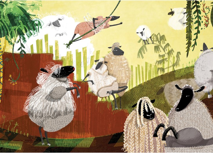
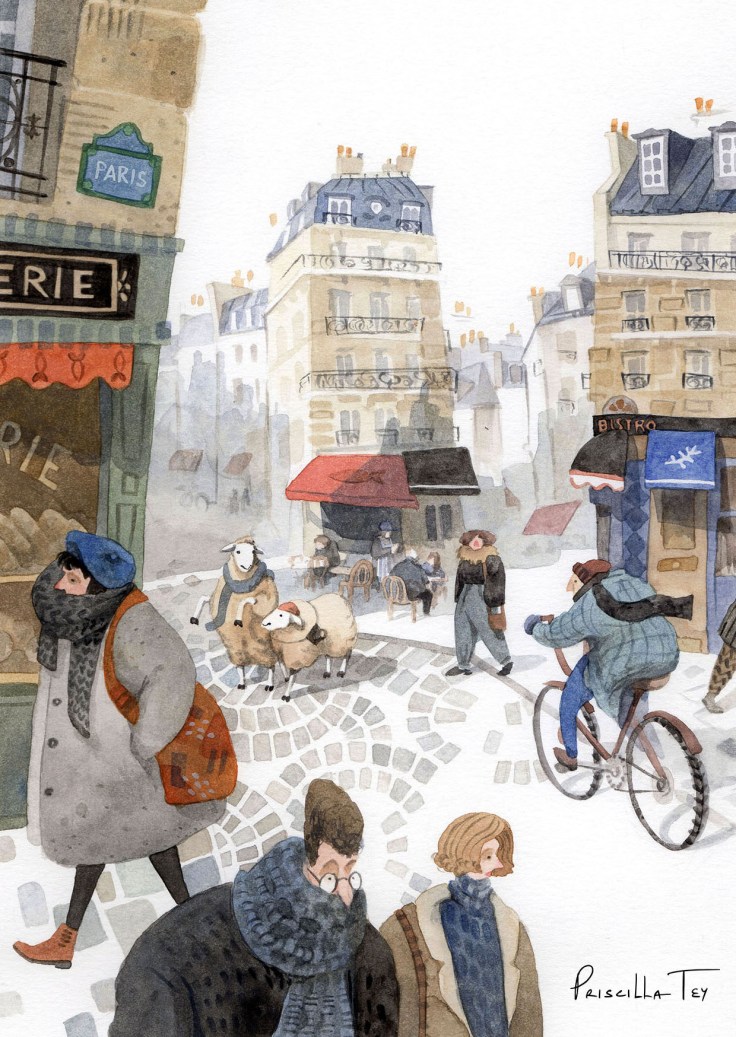
The postcard with my picture book cover on the front for instance, would most likely be targeted at publishers and bookstores. The postcard with the sheep image (Sheep Paradise) was made just after that image was published in Plansponsor magazine. So that was given out to other potential clients. But that was done about 2 years ago which is why I created the vertical image (Lost Sheep in Paris) recently, in the hopes of replacing it. Oh! And I always try to make sure that I have a set of postcards that have a sheep or two in it. Those always reflect my truest self. I love sheep. It’s kind of an obsession. A healthy one.*
*Ha! A sheep obsession is not only healthy but cute. And perfect for children’s publishing!
How often do you send out postcards?
Not as often as I should!* I usually give them out at conferences or events. I do send out a lot of greeting cards during the holiday season that have my more festive work featured. Sometimes I put in a postcard along with the greeting card, depending on who I’m sending it to.*
*
*Ha! That’s what everyone says!
**All good ways to distribute postcards.
Who do you target with your mailings?
Currently, I am mostly targeting children’s publishing and children’s magazines.
How do you compile your mailing list? Any tips on keeping a list and sending out?
It usually starts with a fair bit of online research, checking publishing websites and social media for any clues on who I should address my postcards to. I will compile a list of addresses and begin sending out the postcards.*
*I do a lot of online research too. Takes time but it’s worth it.

Do you have any tips on the production process?
I typically use InDesign or Photoshop to put together the postcards. The fonts I use are usually consistent (sans serif to compliment my handwritten name) and I try to keep things as clean and tidy as possible. Pairing too many typefaces together in one design can get messy and distract the receiver.*
My name is always the same handwritten image that I vectorized in Illustrator so that I can reuse it in various applications without worrying about maintaining resolution. It is also the heading on my website. I guess this has become a logo of sorts.**
Also, I do try to make my contact details more legible and attractive by using custom designed icons that I made in illustrator.
*Good point!
**Having a “brand” is a very important part of self-promotion pieces.

Do you use any online services? What are your favorite places to get postcards printed?
I love the printing quality of Moo.com. Currently that is my favorite place to get my postcards printed. There are also a few local stores in Singapore where I would get them printed, especially if I needed them urgently.
A big thank you to Priscilla for sharing so many helpful tips and your sheep obsession. I think Sub It Club members will be obsessed with your adorable sheep!
Check out more of Priscilla’s work here:
Website: priscillatey.com
Instagram: @priscitey
Twitter: @priscitey
If you’re joining us for the first time at The Postcard Post, you can catch up with a general article on postcard mailings for illustrators and previous featured illustrators in the archive (there’s a tab above too). And you can see recent posts by searching for The Postcard Post on this blog. See you next month.

What wonderful and whimsical art! Thank you for sharing, and congratulations on your book!!
LikeLike
Lovely art. Thank you for sharing!
LikeLike
I like your illustrations a lot!
Wonderful character design and colors!
LikeLike