Happy St. Patrick’s Day from Sub It Club and The Postcard Post! And who better to help us celebrate than author/illustrator Kelly Murphy?! I first saw Kelly’s illustrations when a friend recommended I check out her work in the middle-grade series NATHANIEL FLUDD, BEASTOLOGIST. She thought I’d like it and she was right– I loved it. So, YOU be sure to check out all these gorgeous postcards and the links at the end to see more of Kelly’s work because I think you’ll love it.
Born and raised in southeastern Massachusetts, Kelly Murphy is an accomplished children’s book author and illustrator working predominantly with traditional and mixed media. Kelly has earned an E.B. White Read Aloud Award for illustrating the New York Times Best Seller Masterpiece, and has enjoyed working with stellar authors such as Richard Peck, Jane Yolen, J. Patrick Lewis, Robert San Souci, and R.L. LaFevers. On the side of these numerous and versatile creative achievements, Kelly has engaged in a lasting involvement with art education and is currently a member of the illustration faculty at her alma mater, the Rhode Island School of Design.

How do you choose the image(s) for a postcard?
I’ve always been a bit self-indulgent with postcards and perhaps that method is not strategic for receiving new work. I like choosing images that I personal enjoy rather than images that are so specifically targeted for certain markets. Images with a lot of mood and maybe a touch of mystery are my favorite. I love to have my viewer ask, “What’s going to happen next?”
Do you prefer text on the front of the postcard with the image or do you prefer all text on the back of the postcard?
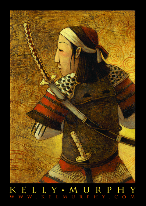
I typically have my website on the front of the card. If art directors/editors want to pin up my card (*I hope they do*),* they can easily track me down without having to remove it from the wall. Additional contact info and recent clients are usually on the back.
*I bet they do! 🙂

Do you create illustrations specifically for your self-promotion pieces?
Except for bookmarks that may announce a book release, I typically always make new artwork for postcards. It’s such a pleasurable challenge to make a new illustration that hopefully displays all of my best qualities.
Some illustrators create a series of postcards and send them out over time. Do you create a series or stand-alone images?
More often than not, I stick to a stand alone image. I love the idea of a picture that creates its own world, full of characters and questions. However, I do have a New Year’s card series that I’ve been doing for the last nine years. They have a certain theme of wishing “cheers” in a different language together with a festive drink recipe. The first winter I was pressed for time and decided that I would make a quicker black and white image to send. Afterwards I was so excited because I was being considered for more middle grade and chapter book illustration. That black and white card was a real game changer, and it was born from time constraint!*
*Ha! You never know, do you?

How often do you send out postcards?
When I first started some years ago, it was every four months. I’d send out roughly three hundred cards each mailing.* I tried to keep it up for the first eight years or so. Now, I do one a year. Before 9-11, I saw a trend of illustrators fabricating gorgeous print packets. Afterwards, the Anthrax scare of 2001 and worried mail rooms made the postcard the best option again to promote one’s work.** I really would love to send more each year.
*Wooow!
**Ah. I never thought of that but it makes sense.

Who do you target with your mailings?
Publishing seems to be the market that really responds to postcard mailings. There’s something about its pace and the way they archive samples of artist’s work. I really only send postcards to publishers. In addition to art directors and editors, I make sure to send it to assistant editors and designers.* Often times, they are the ones bringing new work into meetings and one day they will be in the decision position. Various forms of social media are more conducive for high paced editorial work. I mentioned self indulgence of my imagery earlier, and I fear this is where it fails me. Sometimes, my imagery may be just a bit too mature for the publishers of early picture books, therefore making my postcards unsuitable. I hope that even if it is a tad mature, the editor/art director may see something valuable in the communication of idea and mood.**
*Great idea!
**I hope so too and I think many probably do.
How do you compile your mailing list? Any tips on keeping a list and sending out?
Aye yae yae. My mailing list is a hot mess! It’s the kind of organization only I can understand. I know there must be an easier, alphabetical way.* I have all of my addresses in Microsoft Word, in label format, which makes it terrible to find anything quick. Address changes are entered at the bottom of the form, and if I am really feeling spunky, I’ll try and update the main entry. I used to hand write all of my cards, which took forever, but I still think it’s the best way. Anyone have 5 more hours to add to each day, because I need it! I can confidently say that I have no tips to give for this question! In regards to acquiring names for a mailing list, I love to troll Society of Illustrator’s Original Art Show catalogs.** They list all of the winning books’ info, including publisher, art director, and editor.
*Ha! You aren’t the only one!
**That is a very clever idea. Illustrators, take note: great tip!


Do you have any tips on the production process?
I’ve always loved type and design, never feeling threatened by its different creative calling. The easiest way to talk about type is to envision it having a voice. A chunky, dark, blocky text has a deep monotone voice. Script has an often soothing melodic voice. Then I ask myself what voice works with the pretend narrator of my image. Do they have to get along or can they actually be jarringly different that it creates a conceptual conflict? I try to see the unison of type and image as a healthy marriage, offering respect and support for each other, while allowing each to shine in their own individual way. Legibility is the goal that binds them together. The other important factor of postcard design is the “show stopper” effect. Perhaps it has a bold, bright design that catches the eye across the room. Or, maybe it’s such a subtle image that forces the viewer to bring the card even closer to the eye. It needs to be an image that makes the viewer stop and think for a moment in their busy day.*
*I’m restraining myself from filling this response with asterisks! I need a really giant one. So much sage advice.
Do you use any online services? What are your favorite places to get postcards printed?
Got Print is my all-time favorite. Moo’s got a slick style, but ultimately Got Print has so many options at such a fantastic price.
A big thanks to Kelly for sharing her work and knowledge!
Be sure to check out Kelly and her work all over the internet:
Website: http://www.kelmurphy.com
Twitter: @yllekyhprum
Instagram: yllekyhprum
Blog: http://didyoudrinkmybeer.blogspot.com
Facebook: https://www.facebook.com/kelmurphy
And I enjoyed this Picturebooking podcast interview with Kelly too: http://picturebooking.com/015-kelly-murphy-finding-your-artistic-voice/
If you’re joining us for the first time at The Postcard Post, you can catch up with a general article on postcard mailings for illustrators and previous featured illustrators in the archive (there’s a tab above too). And you can see recent posts by clicking on The Postcard Post under CATEGORIES on the right sidebar of this blog.
See you next month.

Great post! Good use of b/w takes skill, and though the postcards may have been a rush job solution, I’m not surprised to hear it brought Kelly plenty of work. Thanks for reining Kelly in for a post, Dana!
LikeLike
Hey Kelly! Still so glad I got to learn from you in college and ever-so-glad to hear from you in interviews like this. You’re so good at what you do and I appreciate you always taking the time to help others with this kind of advice. There’s some really great tips in here I will be using. Thanks!
LikeLike
Such a great post! I am a longtime fan of Kelly and her work!!!
LikeLike
Reblogged this on Illustration and commented:
Great post for illustrators especially – but anyone interested in kids lit. Some beautiful illustration from Kelly Murphy!
LikeLike
Great post! Lots of tips buried in there for illustrators.
LikeLike