I met C.S. Jennings through his very fun and lively twitter feed. Get ready for great images and helpful advice (on production tasks too) to follow. Enjoy!
C.S. Jennings is a professional illustrator and sometimes author specializing in concept work, children’s, and editorial illustration. He is the author of ANIMAL BAND and HELLO, TEXAS! He is the illustrator of his picture book ANIMAL BAND, Dial Books for Young Reader’s JACOB WONDERBAR chapter books by Nathan Bransford, Capstone’s THE INCREDIBLE ROCKHEAD graphic novel series by Scott Nickel, and A SERIOUS CASE OF THE SILLIES, published by Scholastic.
How do you choose the image(s) for a postcard?
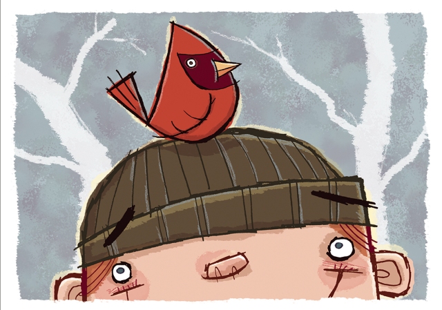
First, the drawing has to make me smile or laugh. I think images with emotional connection have the most impact. Next, I imagine it tacked to a wall, so the image needs to read from five feet or so. Also, it will echo the kind of work I want. I’ve recently done lots of chapter book work, so my postcards now carry my picture book techniques.

this postcard originally had text on top.

(This isn’t the final version of the postcard: keep reading!)
Do you prefer text on the front of the postcard with the image or do you prefer all text on the back of the postcard?
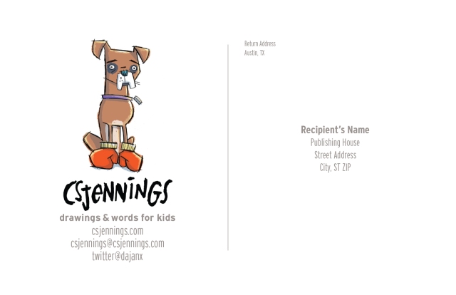
I put the text on the back. I let the illustration do all the talking. Occasionally, I will put my logo on the front, but only if it works with the composition of the drawing. Personally, I never create a composition around the logo. I use text sparingly, keeping it large and legible. I use fonts that are really easy to read. (The point here, afterall, is communication, and while a font may delight you with its whimsy, if your information is not legible, that’s a fail.)*
*Communication is key!

Do you create illustrations specifically for your self-promotion pieces?
Not really. I’ve always got several drawings I am working on, from rough to almost final. I pull from those as they represent my newest ideas and techniques. Some illustrators create a series of postcards and send them out over time.
Do you create a series or stand-alone images?
I don’t do series postcards. But—haha—that’s such a cool idea.* If I were doing a series I think it would be important to build in as much character and setting variety as I could.
*Thanks! You’ll have to come back and show us if you do a series, OK?
How often do you send out postcards?
I send them four times a year.
Who do you target with your mailings?
My mailings target children’s magazines and children’s publishing art directors. I’ve done lots of magazine work and I love the quick turnaround deadlines of that industry. Plus, one of my favorite parts of the work is the people I get to work with. More clients means more fun in that regard. Even if your goal is to illustrate books, magazine work isn’t slumming. It pays the bills and offers real world opportunities to work with art directors. It teaches the practical side of things, like meeting deadlines and integrating client feedback to roughs and final art.*
*Great advice! So much to learn in these situations.

How do you compile your mailing list?
Any tips on keeping a list and sending out?
I use the same methods most people do in gathering that information–THE CHILDREN’S WRITER’S AND ILLUSTRATOR’S MARKET and SCBWI’s (I am a member)* THE BOOK. I also peruse the children’s magazine and book sections of bookstores looking for publications where my style will fit. With the magazine, I take a shot of the addresses on the publisher’s information page with my phone, or I just buy the magazine. To manage my list, I use Excel and import the addresses into Indesign utilizing its variable data capabilities.
*Me too. Great organization and THE BOOK is a big help.
Do you have any tips on the production process?
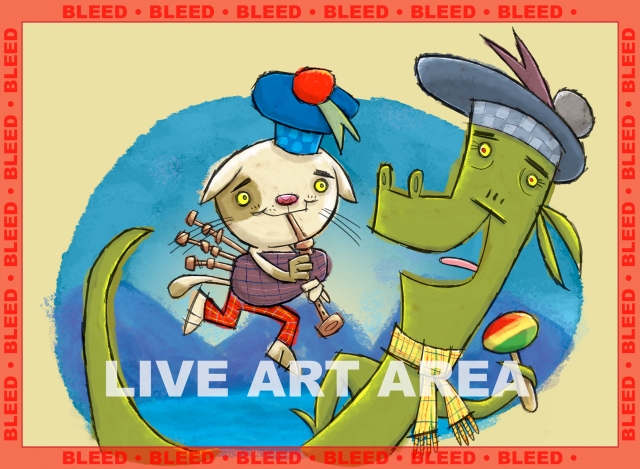
I draw all of my line with graphite (.5, .7, and .9 mechanical pencils loaded with B lead or Col-Erase), I scan at 400-600 dpi, and then add the color digitally in Photoshop. Ideally, with your files for press, work at no lower 300 dpi at 100% (the rule of thumb is, if you need to, you can then enlarge the art 200% before losing image quality). Remember to include “bleed”! If your postcard is 5″x7″, and you want the color to go to the edge, you need to create a 5.5″x7.5″ image. This provides a .25″ area outside of the live postcard area. Printers need bleed, otherwise you would get a white line on the edges. (Even the most precise cutter has a .125″ variance shift.) See my sample jpg for what this looks like. As I am one, I follow the graphic designer’s rule of no more than two fonts. Never use all capitalized letters in a brush script font, and for the love of all that is holy, don’t use the font Comic Sans (it’s cliché and there are so many outstanding fonts out there). Also, the font represents you, so make your choices early and stick with them throughout all of your mailings.*
*Wow! I hope everyone is printing out all that concise, important info.

Do you use any online services? What are your favorite places to get postcards printed?
I use a local print shop I have a relationship with. I like the ability to work directly with a person to be sure I get the results I expect. Plus, I get to handle the papers (I am a paper nerd)* and talk through all the options with them. In the end, they are cheaper than when I have had my cards quoted online and I get a great product every time (and if I didn’t, I have a person to go to).
*I have to admit I like to feel paper too. Paper Nerds Unite!
A big THANK YOU to C.S. for a very informative and inspiring interview!
You can see more of C.S. Jennings’ work at the links below. I highly recommend that you do.
Website: Csjennings.com
Twitter: @dajanx (where I am very active)*
Tmblr: http://csjdraws.tumblr.com
Blog: http://csjennings.blogspot.com
*I know! I really loved your tweet on “99 strange collective animal names”! Lots of important stuff going on on twitter.
If you’re joining us for the first time at the Monthly Postcard Post, you can catch up with a general article on postcard mailings for illustrators and previous featured illustrators in the archive (there’s a tab above too). See you next month.
Great interview! Love that you use local print shops. That’s the way to do it! YEAH! Buy local. Loved learning your process, C.S. The early sketch and final was a lot of fun to watch. Thanks!
LikeLike
Great advice! Thanks for sharing, C.S.!
LikeLike